Promotion Predictor
This is a capstone report of the work done during my internship at Nisum Technologies. The first part of the internship was a promotion predictor that found the best date and price of when to introduce a new item and improved the forecast accuracy. The second part of the internship, which is not included in this report, was to do research on various competition based algorithms and create an MVP competition based algorithm.
Nisum Technologies
Project Overview
Improving forecast accuracy and finding the date and price of when to introduce a new item. For example, there is a new item that a company wants to introduce (i.e. jeans) and they want to know what date and price to introduce the item.
Problem Statement
We improved the forecast by taking the attributes of the new item and comparing this to the other products that are already exist in the catalog. We then look for the products that have the highest number of matches on those attributes and we take the historic data for the existing product and we use this historic data to forecast the price. This is the forecast that we will be improving.
Data Exploration
Exploratory Visualization
One of the first steps is to do some exploratory visualization to look into the dataset. A few things we looked at were basic dataset statistics, boxplots and histograms of bottles sold and price with and without outliers removed, fill rates, and the standard deviation of the price by weekday.
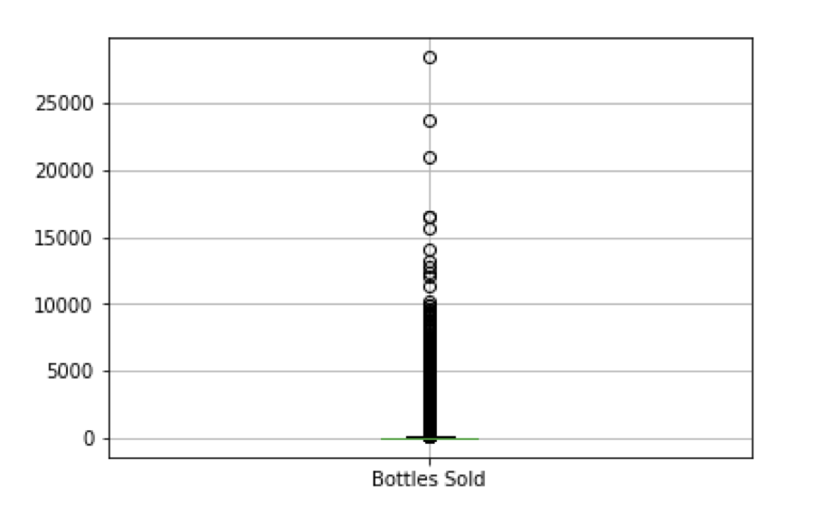
Boxplot for Bottles Sold - Outliers Not Filtered
The boxplot above is a plot of the bottles sold by each store in Iowa with all outliers included. This causes the boxplot to look very skewed by the larger points of data. The box plot is skewed so much that the actual ‘box’ portion of the boxplot, or the central tendency, is unclear. The range of this graph is from 0 to 25,000 bottles sold.
Boxplot for Bottles Sold - Outliers Filtered
The boxplot above is a plot of the bottles sold by each store in Iowa with the major outliers removed. This boxplot does not look skewed by the outliers because the range is only from 0 to 200 and the ‘box’ portion of the boxplot can be seen. The central tendency for bottles sold in Iowa is between 5 and 35 bottles sold.
Boxplot for Price - Outliers Filtered
The boxplot above is a plot of the price for bottles by each store in Iowa. The central tendency is between $8 to $19. The range of this graph is from $0 to $130 so the plot is clear.
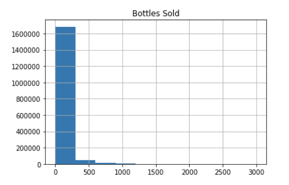
Histogram for Bottles Sold - Outliers Not Filtered
The histogram above is of the bottles sold by each store in Iowa with the major outliers included. This causes the histogram to look very skewed by the larger points of data causing only 4 bars in the graph. A clearer example of the histogram is below
Histogram for Bottles Sold - Outliers Filtered
The histogram above is of the bottles sold by each store in Iowa with the major outliers removed. This causes the histogram to have many more bars within the graph. This graph is easier to analyze and the smaller range allows us to break down the larger chunks from the previous graph and look into the data more closely. We are able to see that most stores sell between 0 - 20 bottles at a time.
Histogram for Price - Outliers Filtered
The histogram above is of the price by each store in Iowa with the major outliers excluded. This causes the boxplot to look very skewed by the larger points of data. We are able to see that the greatest amount of liquor sold in stores is priced between $0 - $12.
Fill Rates
A large portion of the exploratory analysis relied on analyzing fill rates because our liquor data seemed to only have data filled in on the same day every week. Our fill rates were consistently as low as 0-20%. This would not have been ideal for this project since the end goal would be to predict a promotion for one specific day of the week. After much more data exploration, higher fill rates were found for all the categories ranging from 1%-65%.
Steps for calculating fill rates by Category:
Step 1: Filter table to only include data for one specific category
Step 2: Change table to include bottles sold per date and category
Table showing the results of summing the bottles sold for a chosen category.
Step 3: Count number of non-NaN entries in category
Step 4: Count number of total date entries in table
Step 5: Calculate fill rate for chosen category by dividing the number of non-NaN entries by the total date entries
Step 6: Repeat, but with different categories.
Above shows the fill rate for our category with highest fill ratio, 1011200, which had a higher fill rate than every other category.
Algorithms and Techniques
ARIMA and Auto_ARIMA()
ARIMA is an acronym for “AutoRegressive Integrated Moving Average.” A non-seasonal ARIMA model is a combination of differencing with autoregression and a moving average model. The full model is written as:
Above, Y’t is the differencing series, and the terms on the right side represent the lagged values of Yt and lagged errors.
In an ARIMA(p,d,q) model:
● p is the order of the autoregressive part
● d is the degree of first differencing involved
● q is the order of the moving average part
Auto_ARIMA uses a variation of the Hyndman-Khandakar algorithm which combines unit root tests, minimization of the AICc and MLE to obtain an ARIMA model. By default, the model returned by Auto_ARIMA is the model that scores the lowest AICc value, however the user can optionally have the algorithm return the lowest scoring BICc model.
The diagram above is of the general process for forecasting using ARIMA. The Hyndman-Khandakar algorithm (which is what Auto_ARIMA() is a variation of) only uses steps 3-5.
Hyndman-Khandakar Algorithm
Step 1: The number of differences (0<=d<=2) is determined through repeated KPSS tests. The KPSS test determines if a time series is stationary around a mean or linear trend, or is non-stationary due to a unit root. A time series is stationary if statistical properties like the mean and variance are constant over time.
Step 2: The values of p and q are chosen by minimizing the AICc after differencing the data d times. The algorithm uses a stepwise search to traverse the model space.
Initially four data models are fitted:
● ARIMA(0,d,0)
● ARIMA(2,d,2)
● ARIMA(1,d,0)
● ARIMA(0,d,1)
A constant is also included unless d=2. If d<=1, ARIMA(0,d,0) is also fitted without a constant.
The ARIMA model with the lowest AICc value will be set as the current model.
Step 3: Variations of +1 and -1 of the p and/or q values are considered from the current model with inclusions and exclusions of a constant. If a better model is found it will become the new current model.
Step 4: Repeat step 3 until no lower AICc can be found
Step 1: Create a model with Pyramid’s auto_arima
For this project, we used autoregressive integrated moving average (ARIMA) models to assist us in predicting future sales.
Given one years worth of sales, we proved the capabilities of ARIMA by predicting the sales for the first day of the next year, and compared the predicted sales with actual sales for that day. This was accomplished with pyramid auto_ARIMA, which is a python class that will calculate the best Auto-Regressive and Moving-Average parameters for forecasting sales given previous sales data. Auto_arima() will return a model with the lowest scoring AICc or BICc value.
Once an ARIMA model is generated, we utilize pyramid’s fit() method to fit the model in preparation for forecasting, and predict() to retrieve the forecasted sales values.
Step 2: Calculate the Mean Absolute Percentage Error (MAPE)
We measured our forecast accuracy using Mean Absolute Percentage Error, which is calculated by:
The lower the MAPE percentage, the more accurate the forecasted value.
Step 3: Lag data to improve MAPE
To reduce the MAPE value, we can add predictors to the exogenous parameter in the auto_arima, fit and forecast functions. We can take specific categories, lag them by a few days, and use those lagged categories as predictors. A lagged category will shift all of its sales data by a specified number of days. For example, if we wanted to lag a category that originally begins sales on 1/1/18 by two days, all data will be shifted by two days and the first entry will be on 1/3/18, while 1/1/18 and 1/2/18 will contain NaN values. However, to avoid having NaN values we also linearly interpolated the lagged categories. We need to get rid of NaN values because auto_arima, fit and forecast functions will return errors.
Methodology
Data Preprocessing:
1. Getting week & month columns as predictors
For each day of sales, we extracted the specific day of the week and month and created new columns that illustrate which specific day and month the sales took place on.
2. Summing Bottles Sold
The number of bottles sold was summed for each date and category.
3. Pivoting table to make categories columns
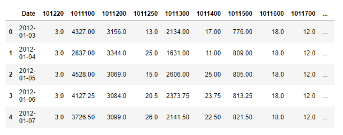
The category column was pivoted so that each category ID became a new column. This was done so that for each category we could see the number of bottles sold for each date. However, pivoting the category column will only give us row entries for dates when bottles were sold.
The table above shows our new dataframe after pivoting. All the categories are now their own columns, with the amount of bottles sold as their entries. However, we don’t have enough daily entries so we need to left join this table with a wider date range.
4. Left Joining category data with a wider date range
The purpose of left joining is that the original data set did not have data for all the dates in the calendar year. When we left joined, we were able to add all the missing dates that the dataset did not contain to have a full year. For example, if the dataset might have had data for only 100 days out of the year then left joining would join the 100 dates with data to the full calendar to get a dataset that has the entire year.
The image above shows our table after left joining to a wider date range. Our table should have more rows containing more dates. However, we have a lot of NaN entries in our data and need to interpolate them.
5. Interpolating table columns
After left joining to a wider date range, we’ll have a lot of categories that won’t have any entries for our new dates. To fix this, we’ll linearly interpolate the data so that there are no NaN entries in our table. The reason we do not want NaN entries in our data is because auto_arima() does not allow NaN values in the endogenous and exogenous parameters.
In our table above, we no longer have any NaN values as we have linearly interpolated the data.
Implementation
1. Determined that the best (p,d,q) values to use was (1,1,1)
After running auto_arima() on each year in our dataset, we found that p=1, d=1 and q=1 was most frequently chosen by auto_arima() to be the best parameters across each year. This indicates that p=1, d=1 and q=1 will most likely give us the best ARIMA model for forecasting.
2. Fit and forecasted sales using an ARIMA model
Once our ARIMA model is generated with the best p,d and q values, we fit the model using the category we want to forecast as the endogenous parameter and the predictors (without the last row of entries) as the exogenous parameter. After fitting, we forecast sales by one day, and use the last row in our predictors as the exogenous parameter.
Refinement
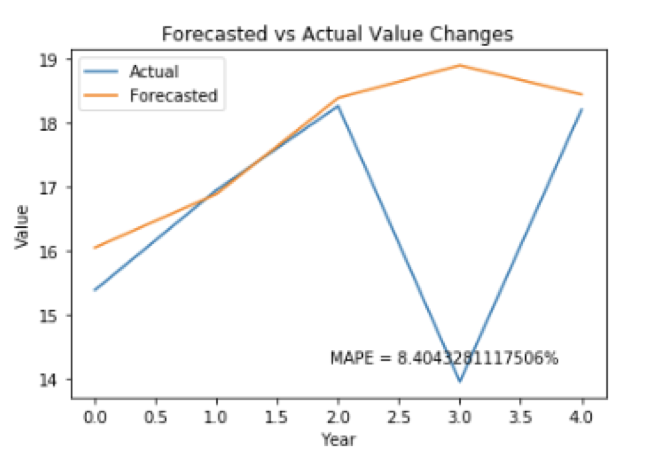
To reduce the MAPE value, we added multiple lagged predictors. The resulting MAPE values of the multiple predictors we tried are shown below.
Results
Category with highest fill ratio: 1011200
MAPE: 9.3710%
Category as best predictor: 1081600
Lag of 2 - MAPE: 8.4043%
Conclusion
Category 1081600 with a lag of two days served as the best predictor for our ARIMA model, and is the category we should use to help forecast sales for our category with highest fill ratio.
Improvements/Reflection
Reflection
After having completed this portion of the project, we realize that there were some harder portions of this project for our team. There was two portions of the project that took longer than we would have liked. The first was finding the fill rates for our dataset. This took between 1-2 weeks of our time because we could not get the correct fill rates for our dataset. The second portion that took longer than anticipated was specifying p,d,q values in the ARIMA model. Even after doing a lot of research, and specifying a (1,1,1) model correctly, our fit function would throw convergence errors whilst using lagged predictors.
Improvements
We also could have used a test set in this project. Normally, a test set is another set of data separate from the training set and validation set that is only used once, and is often around 20% the size of the total set. A test set would have allowed for greater analysis on the reliability of our model with outside data.
Our current method of forecasting was to take a years worth of data and to forecast one day ahead. An improved method would be to forecast one day ahead, then add this day to our training set, and forecast one day ahead again repeatedly for the rest of the next year. This may give us a more accurate idea of the model’s performance. As a consequence, this also may also take all day to compile and in the interest of time we decided against using this method.


